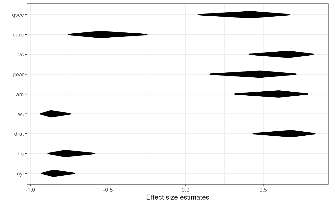
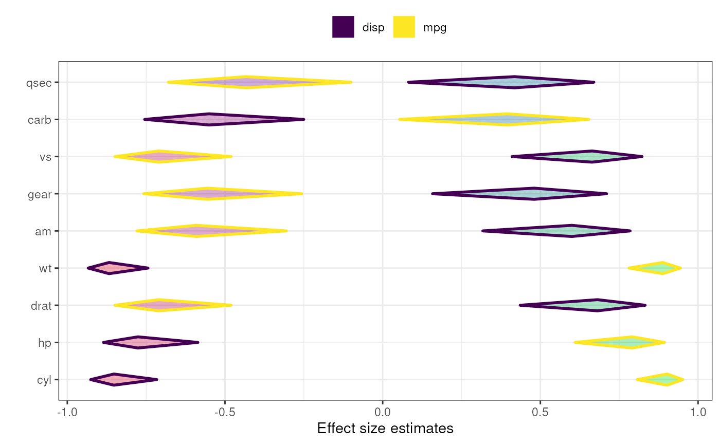
A diamondplot with confidence intervals for associations
Source:R/associationsDiamondPlot.R, R/associationsToDiamondPlotDf.R
associationsDiamondPlot.RdThis function produces is a diamondplot that plots the confidence intervals for associations between a number of covariates and a criterion. It currently only supports the Pearson's r effect size metric; other effect sizes are converted to Pearson's r.
associationsDiamondPlot(
  dat,
  covariates,
  criteria,
  labels = NULL,
  criteriaLabels = NULL,
  decreasing = NULL,
  sortBy = NULL,
  conf.level = 0.95,
  criteriaColors = viridisPalette(length(criteria)),
  criterionColor = "black",
  returnLayerOnly = FALSE,
  esMetric = "r",
  multiAlpha = 0.33,
  singleAlpha = 1,
  showLegend = TRUE,
  xlab = "Effect size estimates",
  ylab = "",
  theme = ggplot2::theme_bw(),
  lineSize = 1,
  outputFile = NULL,
  outputWidth = 10,
  outputHeight = 10,
  ggsaveParams = ufs::opts$get("ggsaveParams"),
  ...
)

associationsToDiamondPlotDf(
  dat,
  covariates,
  criterion,
  labels = NULL,
  decreasing = NULL,
  conf.level = 0.95,
  esMetric = "r"
)
Arguments
- dat
The dataframe containing the relevant variables.
- covariates
The covariates: the list of variables to associate to the criterion or criteria, usually the predictors.
- criteria, criterion
The criteria, usually the dependent variables; one criterion (one dependent variable) can also be specified of course. The helper function
associationsToDiamondPlotDfalways accepts only one criterion.- labels
The labels for the covariates, for example the questions that were used (as a character vector).
- criteriaLabels
The labels for the criteria (in the legend).
- decreasing
Whether to sort the covariates by the point estimate of the effect size of their association with the criterion. Use
NULLto not sort at all,TRUEto sort in descending order, andFALSEto sort in ascending order.- sortBy
When specifying multiple criteria, this can be used to indicate by which criterion the items should be sorted (if they should be sorted).
- conf.level
The confidence of the confidence intervals.
- criteriaColors, criterionColor
The colors to use for the different associations can be specified in
criteriaColors. This should be a vector of valid colors with at least as many elements as criteria are specified incriteria. If only one criterion is specified, the color incriterionColoris used.- returnLayerOnly
Whether to return the entire object that is generated, or just the resulting ggplot2 layer.
- esMetric
The effect size metric to plot - currently, only 'r' is supported, and other values will return an error.
- multiAlpha, singleAlpha
The transparency (alpha channel) value of the diamonds for each association can be specified in
multiAlpha, and if only one criterion is specified, the alpha level of the diamonds can be specified insingleAlpha.- showLegend
Whether to show the legend.
- xlab, ylab
The label to use for the x and y axes (for
duoComparisonDiamondPlot, must be vectors of two elements). UseNULLto not use a label.- theme
The
ggplot()theme to use.- lineSize
The thickness of the lines (the diamonds' strokes).
- outputFile
A file to which to save the plot.
- outputWidth, outputHeight
Width and height of saved plot (specified in centimeters by default, see
ggsaveParams).- ggsaveParams
Parameters to pass to ggsave when saving the plot.
- ...
Any additional arguments are passed to
diamondPlot()and eventually toggDiamondLayer().
Value
A plot.
Details
associationsToDiamondPlotDf is a helper function that produces the required dataframe.
This function can be used to quickly plot multiple confidence intervals.
See also
Examples
### Simple diamond plot with correlations
### and their confidence intervals

associationsDiamondPlot(mtcars,
                        covariates=c('cyl', 'hp', 'drat', 'wt',
                                     'am', 'gear', 'vs', 'carb', 'qsec'),
                        criteria='mpg');


### Same diamond plot, but now with two criteria,
### and colouring the diamonds based on the
### correlation point estimates: a gradient
### is created where red is used for -1,
### green for 1 and blue for 0.

associationsDiamondPlot(mtcars,
                        covariates=c('cyl', 'hp', 'drat', 'wt',
                                     'am', 'gear', 'vs', 'carb', 'qsec'),
                        criteria=c('mpg', 'disp'),
                        generateColors=c("red", "blue", "green"),
                        fullColorRange=c(-1, 1));
