Convenience functions for ggplots based on multiple variables
Source:R/ggEasyBar.R, R/ggEasyRidge.R
ggEasyPlots.RdThese are convenience functions to quickly generate plots for multiple variables, with the variables in the y axis.
ggEasyBar(
  data,
  items = NULL,
  labels = NULL,
  sortByMean = TRUE,
  xlab = NULL,
  ylab = NULL,
  scale_fill_function = NULL,
  fontColor = "white",
  fontSize = 2,
  labelMinPercentage = 1,
  showInLegend = "both",
  legendRows = 2,
  legendValueLabels = NULL,
  biAxisLabels = NULL
)

ggEasyRidge(
  data,
  items = NULL,
  labels = NULL,
  sortByMean = TRUE,
  xlab = NULL,
  ylab = NULL
)
Arguments
- data
The dataframe containing the variables.
- items
The variable names (if not provided, all variables will be used).
- labels
Labels can optionally be provided; if they are, these will be used instead of the variable names.
- sortByMean
Whether to sort the variables by mean value.
- xlab, ylab
The labels for the x and y axes.
- scale_fill_function
The function to pass to
ggplot()to provide the colors of the bars. IfNULL, set toggplot2::scale_fill_viridis_d(labels = legendValueLabels, guide = ggplot2::guide_legend(title = NULL, nrow=legendRows, byrow=TRUE)).- fontColor, fontSize
The color and size of the font used to display the labels
- labelMinPercentage
The minimum percentage that a category must reach before the label is printed (in whole percentages, i.e., on a scale from 0 to 100).
- showInLegend
What to show in the legend in addition to the values; nothing ("
none"), the frequencies ("freq"), the percentages ("perc"), or both ("both"). This is only used if only one variable is shown in the plot; afterwise, after all, the absolute frequencies and percentages differ for each variable.- legendRows
Number or rows in the legend.
- legendValueLabels
Labels to use in the legend; must be a vector of the same length as the number of categories in the variables.
- biAxisLabels
This can be used to specify labels to use if you want to use labels on both the left and right side. This is mostly useful when plotting single questions or semantic differentials. This must be a list with two character vectors,
leftAnchorsandrightAnchors, which must each have the same length as the number of items specified initems. See the examples for, well, examples.
Value
A ggplot() plot is returned.
See also
geom_ridgeline(), geom_bar()
Examples
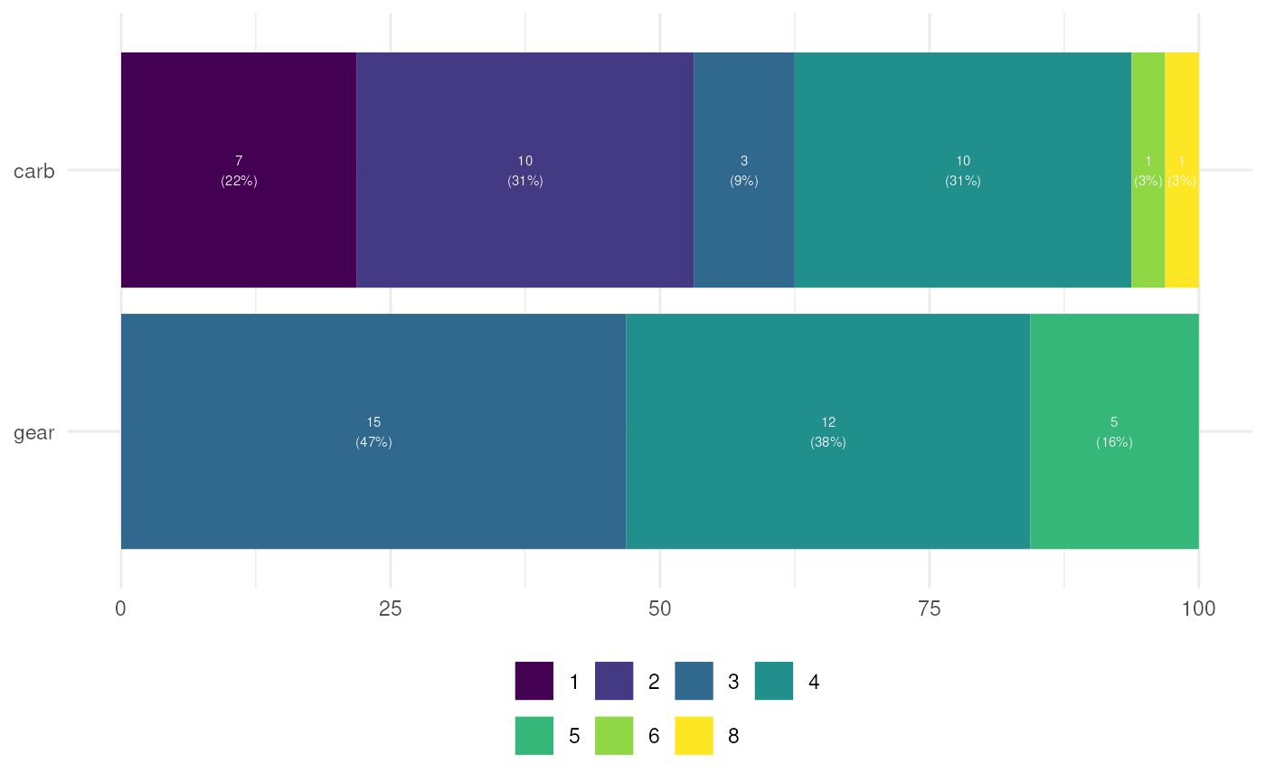
ggEasyBar(mtcars, c('gear', 'carb'));

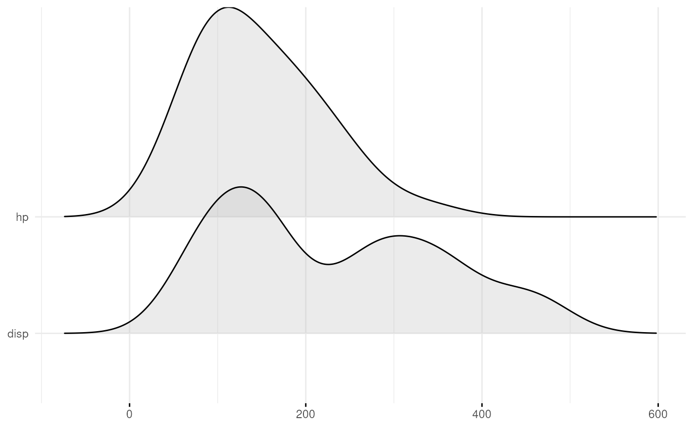
ggEasyRidge(mtcars, c('disp', 'hp'));
#> Picking joint bandwidth of 41.9


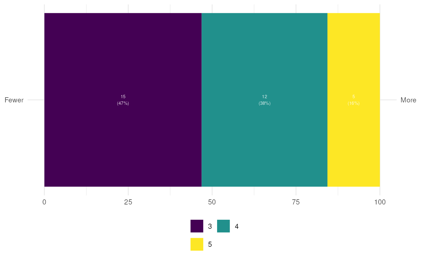
### When plotting single questions, if you want to show the anchors:
ggEasyBar(mtcars, c('gear'),
          biAxisLabels=list(leftAnchors="Fewer",
                            rightAnchors="More"));


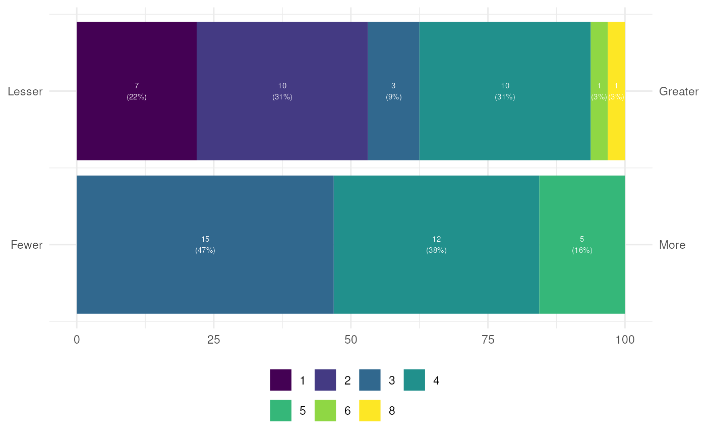
### Or for multiple questions (for e.g. semantic differentials):
ggEasyBar(mtcars, c('gear', 'carb'),
          biAxisLabels=list(leftAnchors=c("Fewer", "Lesser"),
                            rightAnchors=c("More", "Greater")));
