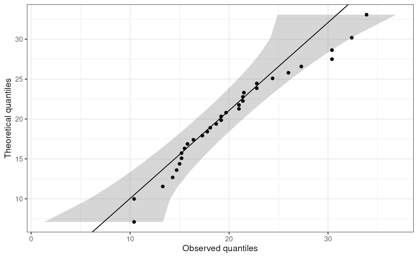
This function creates a qq-plot with a confidence interval.
ggqq(
  x,
  distribution = "norm",
  ...,
  ci = TRUE,
  line.estimate = NULL,
  conf.level = 0.95,
  sampleSizeOverride = NULL,
  observedOnX = TRUE,
  scaleExpected = TRUE,
  theoryLab = "Theoretical quantiles",
  observeLab = "Observed quantiles",
  theme = ggplot2::theme_bw()
)
Arguments
- x
A vector containing the values to plot.
- distribution
The distribution to (a 'd' and 'q' are prepended, and the resulting functions are used, e.g.
dnormandqnormfor the normal curve).- ...
Any additional arguments are passed to the quantile function (e.g.
qnorm). Because of these dots, any following arguments must be named explicitly.- ci
Whether to show the confidence interval.
- line.estimate
Whether to show the line showing the match with the specified distribution (e.g. the normal distribution).
- conf.level
THe confidence of the confidence leven arround the estimate for the specified distribtion.
- sampleSizeOverride
It can be desirable to get the confidence intervals for a different sample size (when the sample size is very large, for example, such as when this plot is generated by the function
normalityAssessment). That different sample size can be specified here.- observedOnX
Whether to plot the observed values (if
TRUE) or the theoretically expected values (ifFALSE) on the X axis. The other is plotted on the Y axis.- scaleExpected
Whether the scale the expected values to match the scale of the variable. This option is provided to be able to mimic SPSS' Q-Q plots.
- theoryLab
The label for the theoretically expected values (on the Y axis by default).
- observeLab
The label for the observed values (on the Y axis by default).
- theme
The theme to use.
Value
A ggplot plot is returned.
Details
This is strongly based on the answer by user Floo0 to a Stack Overflow
question at Stack Exchange (see
https://stackoverflow.com/questions/4357031/qqnorm-and-qqline-in-ggplot2/27191036#27191036),
also posted at GitHub (see
https://gist.github.com/rentrop/d39a8406ad8af2a1066c). That code is in
turn based on the qqPlot() function from the car package.
Examples
ggqq(mtcars$mpg);
