meansComparisonDiamondPlot and duoComparisonDiamondPlot
Source:R/duoComparisonDiamondPlot.R, R/meansComparisonDiamondPlot.R
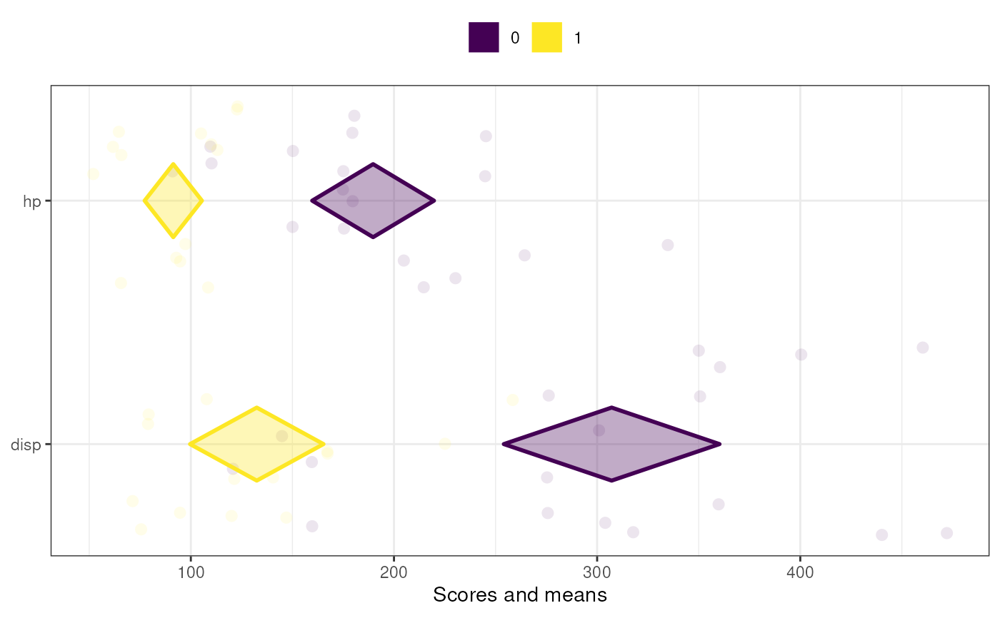
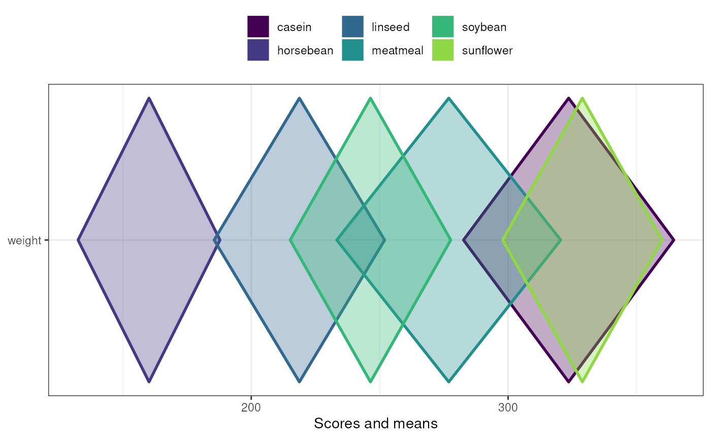
comparisonDiamondPlots.RdThese are two diamond plot functions to conveniently make diamond plots to compare subgroups or different samples. They are both based on a univariate diamond plot where colors are used to distinguish the data points and diamonds of each subgroup or sample. The means comparison diamond plot produces only this plot, while the duo comparison diamond plot combines it with a diamond plot visualising the effect sizes of the associations. The latter currently only works for two subgroups or samples, while the simple meansComparisonDiamondPlot also works when comparing more than two sets of datapoints. These functions are explained more in detail in Peters (2017).
duoComparisonDiamondPlot(
  dat,
  items = NULL,
  compareBy = NULL,
  labels = NULL,
  compareByLabels = NULL,
  decreasing = NULL,
  conf.level = c(0.95, 0.95),
  showData = TRUE,
  dataAlpha = 0.1,
  dataSize = 3,
  comparisonColors = viridisPalette(length(unique(dat[, compareBy]))),
  associationsColor = "grey",
  alpha = 0.33,
  jitterWidth = 0.5,
  jitterHeight = 0.4,
  xlab = c("Scores and means", "Effect size estimates"),
  ylab = c(NULL, NULL),
  plotTitle = NULL,
  theme = ggplot2::theme_bw(),
  showLegend = TRUE,
  legend.position = "top",
  lineSize = 1,
  drawPlot = TRUE,
  xbreaks = "auto",
  outputFile = NULL,
  outputWidth = 10,
  outputHeight = 10,
  ggsaveParams = ufs::opts$get("ggsaveParams"),
  ...
)

meansComparisonDiamondPlot(
  dat,
  items = NULL,
  compareBy = NULL,
  labels = NULL,
  compareByLabels = NULL,
  decreasing = NULL,
  sortBy = NULL,
  conf.level = 0.95,
  showData = TRUE,
  dataAlpha = 0.1,
  dataSize = 3,
  comparisonColors = viridisPalette(length(unique(dat[, compareBy]))),
  alpha = 0.33,
  jitterWidth = 0.5,
  jitterHeight = 0.4,
  xlab = "Scores and means",
  ylab = NULL,
  plotTitle = NULL,
  theme = ggplot2::theme_bw(),
  showLegend = TRUE,
  legend.position = "top",
  lineSize = 1,
  xbreaks = "auto",
  outputFile = NULL,
  outputWidth = 10,
  outputHeight = 10,
  ggsaveParams = ufs::opts$get("ggsaveParams"),
  ...
)
Arguments
- dat
The dataframe containing the relevant variables.
- items
The variables to plot (on the y axis).
- compareBy
The variable by which to compare (i.e. the variable indicating to which subgroup or sample a row in the dataframe belongs).
- labels
The labels to use on the y axis; these values will replace the variable names in the dataframe (specified in
items).- compareByLabels
The labels to use to replace the value labels of the
compareByvariable.- decreasing
Whether to sort the variables by their mean values (
NULLto not sort,TRUEto sort in descending order (i.e. items with lower means are plotted more to the bottom), andFALSEto sort in ascending order (i.e. items with lower means are plotted more to the top).- conf.level
The confidence level of the confidence intervals specified by the diamonds for the means (for
meansComparisonDiamondPlot) and for both the means and effect sizes (forduoComparisonDiamondPlot).- showData
Whether to plot the data points.
- dataAlpha
The transparency (alpha channel) value for the data points: a value between 0 and 1, where 0 denotes complete transparency and 1 denotes complete opacity.
- dataSize
The size of the data points.
- comparisonColors
The colors to use for the different subgroups or samples. This should be a vector of valid colors with at least as many elements as sets of data points that should be plotted.
- associationsColor
For
duoComparisonDiamondPlot, the color to use to plot the effect sizes in the right-hand plot.- alpha
The alpha channel (transparency) value for the diamonds: a value between 0 and 1, where 0 denotes complete transparency and 1 denotes complete opacity.
- jitterWidth, jitterHeight
How much noise to add to the data points (to prevent overplotting) in the horizontal (x axis) and vertical (y axis) directions.
- xlab, ylab
The label to use for the x and y axes (for
duoComparisonDiamondPlot, must be vectors of two elements). UseNULLto not use a label.- plotTitle
Optionally, for
meansComparisonDiamondPlot, a title for the plot (can also be specified forduoComparisonDiamondPlot, in which case it's passed on tomeansComparisonDiamondPlotfor the left panel - but note that this messes up the alignment of the two panels).- theme
The theme to use for the plots.
- showLegend
Whether to show the legend (which color represents which subgroup/sample).
- legend.position
Where to place the legend in
meansComparisonDiamondPlot(can also be specified forduoComparisonDiamondPlot, in which case it's passed on tomeansComparisonDiamondPlotfor the left panel - but note that this messes up the alignment of the two panels).- lineSize
The thickness of the lines (the diamonds' strokes).
- drawPlot
Whether to draw the plot, or only (invisibly) return it.
- xbreaks
Where the breaks (major grid lines, ticks, and labels) on the x axis should be.
- outputFile
A file to which to save the plot.
- outputWidth, outputHeight
Width and height of saved plot (specified in centimeters by default, see
ggsaveParams).- ggsaveParams
Parameters to pass to ggsave when saving the plot.
- ...
Any additional arguments are passed to
diamondPlot()bymeansComparisonDiamondPlotand to bothmeansComparisonDiamondPlotandassociationsDiamondPlot()byduoComparisonDiamondPlot.- sortBy
If the variables should be sorted (see
decreasing), this variable specified which subgroup should be sorted by. Therefore, the value specified here must be a value label ('level label') of thecompareByvariable.
Value
A Diamond plots: a ggplot2::ggplot() plot
meansComparisonDiamondPlot, and a gtable() by
duoComparisonDiamondPlot.
Details
These functions are explained in Peters (2017).
References
Peters, G.-J. Y. (2017). Diamond Plots: a tutorial to introduce a visualisation tool that facilitates interpretation and comparison of multiple sample estimates while respecting their inaccuracy. PsyArXiv. http://doi.org/10.17605/OSF.IO/9W8YV
See also
diamondPlot(), meansDiamondPlot(), the CIBER() function in
the behaviorchange package
Examples
meansComparisonDiamondPlot(mtcars,
                           items=c('disp', 'hp'),
                           compareBy='vs',
                           xbreaks=c(100,200, 300, 400));

meansComparisonDiamondPlot(chickwts,
                           items='weight',
                           compareBy='feed',
                           xbreaks=c(100,200,300,400),
                           showData=FALSE);

duoComparisonDiamondPlot(mtcars,
                         items=c('disp', 'hp'),
                         compareBy='vs',
                         xbreaks=c(100,200, 300, 400));
#> Error: Cannot create zero-length unit vector ("unit" subsetting)